The Collage Myth: Every Scrap Does Not Need to Match
Collage scraps do not need to match: use contrast, scale and placement to turn unrelated paper into a composition that feels deliberate.
The common collage mistake is rejecting a lively scrap because its colours or subject do not match the rest; the cost is a page that feels tidy but lifeless. Collage scraps do not need to match for a composition to feel deliberate. What matters is how their differences are arranged: an odd image can become a focal point, a clash can make a quiet area sing, and a tiny fragment can alter the weight of a whole page.
Let the relationship matter more than the source
It is tempting to judge each piece on its own. A strip of floral wrapping paper, a torn map fragment and a bold block of packaging may look unrelated in a pile. On the page, though, each scrap is read beside its neighbours, so the composition comes from their relationships rather than a shared origin.
Think of a collage as a conversation between shapes, colours, textures and images. Two scraps need not depict the same subject if they share a useful feature: perhaps both have a curved edge, a dark area or a repeating pattern. Conversely, pieces that seem similar can still make a dull pairing if they have the same size and visual weight.
This is why a collection of carefully matching paper can feel flat. If every piece offers the same sort of colour, detail and scale, the eye has little reason to move. A contrasting scrap gives it something to notice, then placement can lead it towards the rest of the page.
Use contrast as a deliberate choice
Contrast is not simply difference for its own sake. It is a difference that helps organise attention. A bright scrap can stand out against a muted field; a smooth piece can interrupt rough newsprint; a recognisable photograph can sit among abstract marks. The contrast becomes useful when the rest of the composition gives it a role.
Try sorting scraps by qualities instead of by subject. Make loose groups for light and dark, smooth and rough, busy and quiet, hard-edged and torn. These groups are not rules for choosing matching pieces. They help you see what a potential newcomer might contribute.
For instance, if a page is crowded with small printed details, a plain piece of coloured paper can provide breathing room. If the layout feels too calm, a sharply patterned fragment may bring energy. The question is not “Does this belong with the others?” but “What changes if I put it here?”
Let scale create rhythm
Scale gives scraps different jobs. A broad piece can anchor the page, while narrow strips and tiny fragments carry the eye across it. If everything is cut to similar dimensions, the arrangement can resemble a tiled surface. A mix of large, medium and small shapes creates a more varied rhythm.
Start by placing one or two larger pieces loosely on the backing paper. They establish broad areas of colour and shape without needing to dictate the whole design. Add smaller pieces where the arrangement needs a pause, an accent or a connection between separated areas.
Size is relative, not absolute. A small red triangle may command attention beside a large, pale sheet because its colour is vivid and its edge is sharp. A dark fragment can feel substantial even when it is physically small. Consider both the scrap’s dimensions and the strength of its colour, pattern and image.
Placement turns a mismatch into a composition
Before reaching for glue, move the pieces around. A scrap’s position changes what it seems to say: close to another image, it may look like a continuation; further away, it may act as a counterpoint. Overlap can make separate sources feel connected, while a clear gap can preserve contrast and give a busy motif room.
Pay attention to the page’s visual weight. Strong colours, dark areas, dense patterns and recognisable faces tend to draw the eye. If they all cluster in one corner, the rest of the page may feel neglected. A small counterweight elsewhere—a bright strip, a dark mark or a cluster of tiny scraps—can make the arrangement feel more balanced without making it symmetrical.
Edges matter too. A torn edge can soften a sharp printed rectangle; a clean cut can make a ragged group feel intentional. Let some edges overlap and leave others exposed so the viewer can see where each fragment begins and ends. Repeating a shape or colour in more than one place can help the eye travel, even when the imagery itself has no common theme.
Build a page from unrelated scraps
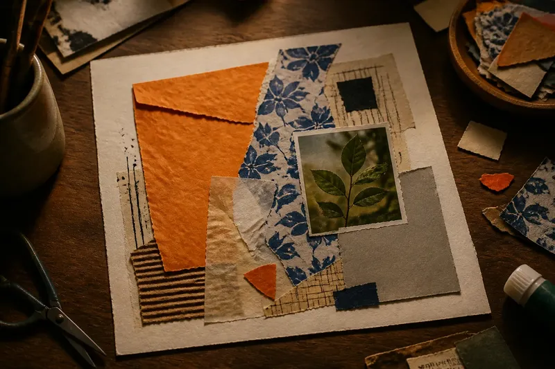
Say you have a torn orange envelope, a strip of blue-and-white wrapping paper, a small leaf photograph and a piece of plain grey card. Imagine placing the orange envelope as a large, off-centre base, then setting the blue pattern across one edge so it overlaps. The leaf image could sit apart from the pattern, while the grey card fills a busy gap; the expected result is a page that holds together through placement and changes of scale, not through matching subjects.
To try this approach with your own materials, gather a backing sheet, scrap paper, scissors and a glue stick. Include one material with a noticeable texture, such as tissue paper, a paper bag or a fragment of corrugated card, if it suits the surface you are using.
- Choose a backing sheet that leaves room around the arrangement; a visible border can help the collage feel contained.
- Pick a few scraps for different roles: one broad shape, one detailed image and one simple or quiet piece.
- Place the largest shapes first, keeping them loose so they can shift as you work.
- Add a contrasting scrap where it can attract attention or connect two separated areas.
- Step back and check whether the eye has somewhere to enter, pause and move on; relocate a piece if one area overwhelms the rest.
- When the arrangement feels settled, lift and glue the pieces one at a time, smoothing paper gently from the centre towards the edges.
For a digital collage, the same decisions apply. In an app such as Procreate or Canva, keep separate image layers so you can resize and reposition fragments before flattening the composition. The screen makes it easy to move pieces, but the useful question remains the same: what does each element contribute to its neighbours?
How can unrelated collage pieces feel intentional?
Do collage pieces have to share a colour palette?
No. A shared palette can create cohesion, but it is only one possible connection. Similar scale, repeated shapes, a common texture or a deliberate pattern of placement can also link unrelated scraps.
How do I stop contrasting scraps from looking random?
Give each contrast a purpose, such as drawing attention, breaking up a dense area or linking two parts of the page. Repeat a colour or shape somewhere else if the standout fragment feels stranded.
Should I glue the largest pieces first?
It often helps to arrange larger pieces first because they set the broad structure. Keep everything movable until you have checked the small accents and the balance across the page.
Can photographs and patterned paper work together?
Yes. A photograph can offer a recognisable focal point, while patterned paper provides movement around it. Leave enough visual breathing room that neither element obscures the other.
Know when the contrast is doing too much
A collage can feel unsettled if every piece demands attention. When bright colour, intricate pattern and strong imagery all compete, remove or cover one element and look again. This is not a call to make everything harmonious; it is a way to let one or two contrasts lead while the others support them.
Also check whether the materials behave well together. Thin magazine paper may buckle under a wet adhesive, while heavy card can lift from a flexible backing. The right choice depends on the paper and adhesive labels, manufacturer instructions and the surface you are using.
There is no need to make every edge neat or every gap equal. A torn join, an unexpected colour and a fragment from an unrelated image can all help the page feel alive. Collage scraps do not need to match when contrast, scale and placement give each one a clear reason to be there.