Why a Small Colour Palette Can Make a Page Feel Cohesive
A small colour palette makes a page feel cohesive by linking separate marks. Learn how to choose a few hues and repeat them without flattening the design.
The common mistake with a colour palette is adding a new hue whenever a page feels unfinished; the cost is that separate marks start competing instead of belonging together. A small colour palette can make a page feel cohesive by giving scattered shapes, lettering and accents a few colours to share. The trick is not to use every colour equally, but to let a handful of hues return in deliberate places.
A page needs links more than more colour
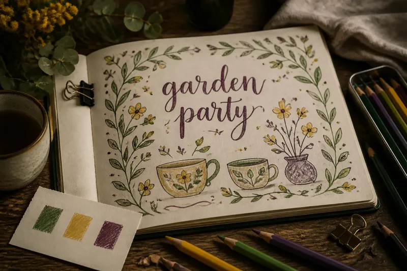
Imagine you are making a playful page in a sketchbook for a friend’s garden party. You have drawn a loose border of leaves, a central hand-lettered greeting and a few small cups and flowers, but the page feels like several unrelated doodles. The leaves are green, the lettering is purple, and each object has picked up a different colour from the tin of pencils.
Instead of adding another shade, you pause and choose three colours already on the page: leaf green, warm yellow and plum. Green can return in a cup handle, yellow in a small flower centre, and plum in a leaf vein or border mark. Those repetitions create visual links, so the eye can travel from one area to another without every object needing identical colouring.
This is the central value of a limited palette: it gives variety a shared vocabulary. Shapes can differ in scale and subject while recurring hues quietly connect them. The page still has room for surprise, but the colours no longer feel as though they arrived from separate projects.
Choose a palette that suits the page’s mood
Start with the feeling you want, then select a few hues that can carry it. A cool combination such as blue, blue-green and a small note of coral may feel fresh and breezy; rust, ochre and muted violet can feel warmer and more earthy. These are starting points, not rules: the materials you have and the subject itself can suggest a better mix.
For the imagined garden-party page, the existing green, yellow and plum already suggest a lively, slightly informal mood. Keeping those colours is easier than forcing a new scheme onto the drawing, and it makes the palette feel connected to the marks that sparked the project. If one hue seems too loud beside the others, use it on fewer details rather than adding more colours to tame it.
Test the selection on a scrap of the same paper, especially if you are using markers, watercolour pencils or coloured pencils. A colour that looks gentle in the tin may appear stronger after several pencil passes, while a marker can soak into paper and look quite different from a dry pencil mark. Keep the swatches visible beside the page as a simple reference.
Give each hue a different job
A palette feels more intentional when its colours do not all shout at once. Choose one hue to carry the largest areas, another to support it, and a third for small points of emphasis. This is a flexible division of labour, not a formula: the supporting colour might cover most of a border, while the emphasis hue appears only in a few tiny details.
On the garden-party page, green can colour the leafy border and appear again in a few small accents. Yellow can pick out flower centres and a detail in the lettering, while plum can stay mostly in the greeting and a handful of tiny marks. That distribution gives the plum visual weight without asking it to fill every available shape.
Leave some areas as bare paper. White space gives coloured marks room to register and stops a small palette from becoming a solid block of pigment. If the page is made with coloured paper rather than white, the paper itself can act as a quiet fourth presence; let it remain visible instead of automatically filling every gap.
Repeat colours with variation
Repetition does not mean copying the same mark over and over. A green leaf, a short green line and a green letter detail can share a hue while differing in shape and purpose. The repeated colour creates recognition; the changed mark keeps the page lively.
There is also room to vary how strongly a hue appears. With coloured pencils, a light layer can give a softer note than a closely worked patch. With watercolour, a more diluted wash can sit beside a deeper mark of the same colour, provided the paper and materials suit that approach. Keep the changes legible enough that the marks still read as relatives, rather than unrelated shades.
In the garden-party drawing, a few plum accents can echo the greeting without turning every flower purple. A soft yellow mark on one cup might answer a brighter yellow flower centre elsewhere. These small callbacks help the eye make connections, while differences in placement and strength prevent the page from looking mechanically repeated.
What should you do when a colour feels out of place?
Should every object use every palette colour?
No. Let objects keep their own character, and use a shared hue in a detail where it feels plausible. A cup might need only a green handle to connect it to the leafy border.
Can a small palette include a neutral?
Yes. The paper colour, graphite or a quiet grey can give brighter hues breathing space. Treat a neutral as part of the page’s visual language, especially if it appears in several places.
What if the page already has too many colours?
Choose a few existing hues to repeat from this point onward, rather than trying to cover or erase every stray mark. Let the chosen colours return in useful places so they gradually become the page’s clearest connections.
How can the palette stay fresh without adding another hue?
Vary the size, shape and strength of the marks. A narrow outline, a broad patch and a faint detail can all use the same colour while bringing different kinds of emphasis.
Let the last marks answer the first ones
When the page appears nearly complete, look for an isolated colour rather than a general lack of decoration. In the imagined sketchbook drawing, perhaps the yellow flower centres have no partner elsewhere; a small yellow detail in the greeting could tie them to the focal lettering. If a hue already appears in several connected places, resist the urge to distribute it everywhere.
That final pause is useful because a cohesive page is not necessarily a page with perfect balance or identical objects. It is one where the repeated hues help the parts speak to one another. A small colour palette works best when each return has a reason: it links a border to a central mark, softens an empty corner or gives the eye a route across the page.
For your next page, keep the swatch scrap beside the drawing and choose the palette before adding finishing details. A small colour palette can make a page feel cohesive without making it predictable, especially when you repeat hues selectively and let the marks themselves keep changing.